TartanHQ
2026
Building a system for scale.
A centralized component library built to unify a fragmented product ecosystem — bringing consistency, speed, and scalability across every product surface.

Overview
One system. Every product.
TartanHQ's products had grown fast, but the design behind them hadn't grown with any shared structure. Every product team was solving the same UI problems independently different chart libraries, different input patterns, different visual language and it was starting to show, both in the product experience and in how long it took to design and build anything new.
I partnered with my design lead to build a centralized component library from the ground up: auditing what already existed, defining what needed to be built, and creating a governed system that any product team could adopt without slowing down.
Problem
Consistent everywhere. Defined nowhere.
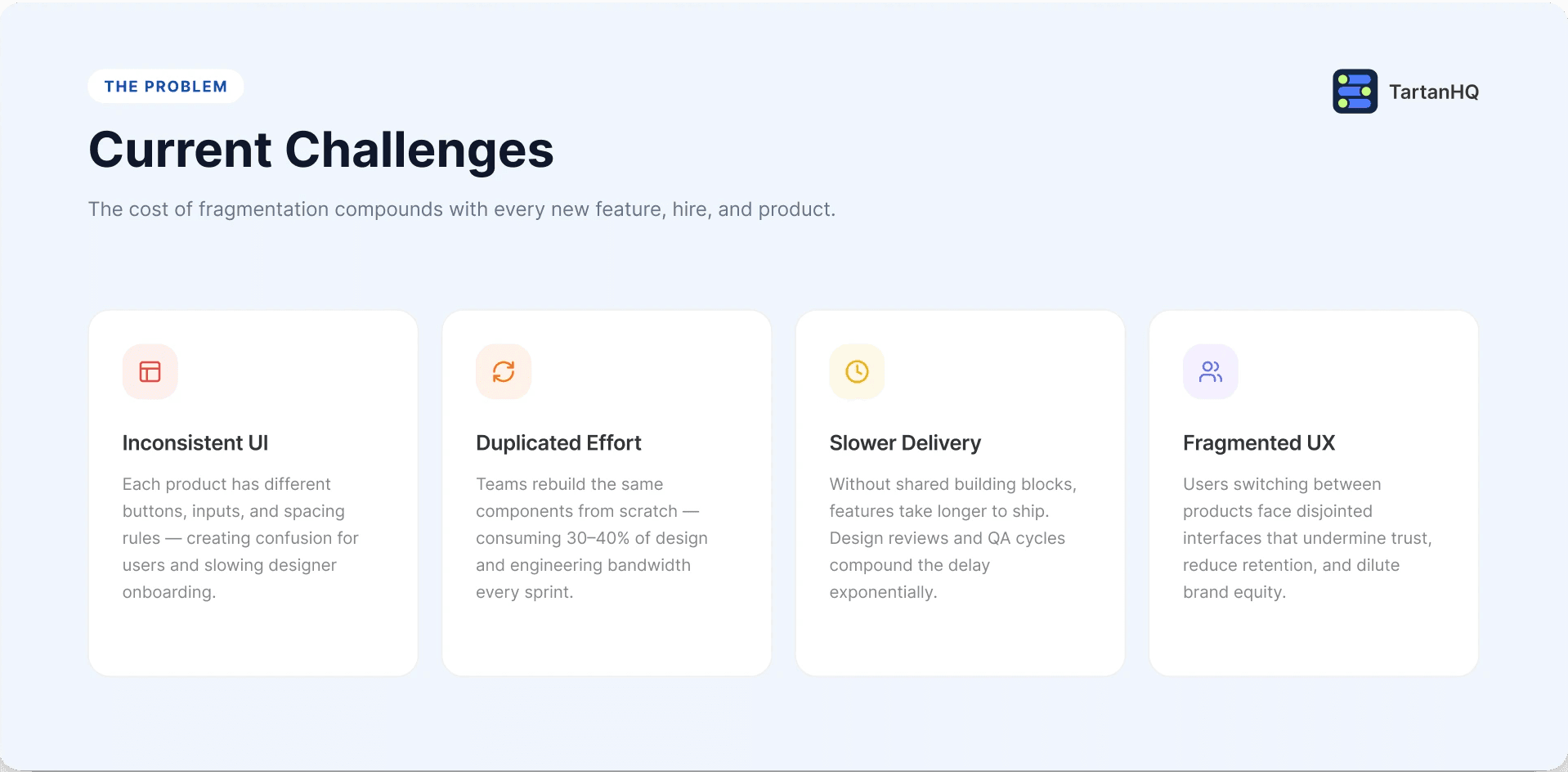
There was no single source of truth for design. Similar components had been rebuilt slightly differently across products sometimes down to using entirely different charting libraries for the same type of data. This created three compounding problems:
Inconsistency — products didn't feel like they belonged to the same company
Duplicated effort — designers and engineers kept rebuilding the same components from scratch
No governance — there was no process for deciding what got reused vs. rebuilt
Research
Learning before building.
Before designing anything new, I audited every product surface to map where visual and functional patterns diverged. I catalogued which components were reusable as-is, which needed refinement, and which gaps had no existing solution at all. I also researched design systems across SaaS and adjacent domains to understand common patterns, naming conventions, and governance models worth borrowing from.
This groundwork meant we weren't designing in a vacuum every decision was grounded in what already existed in the product, and validated against how mature systems elsewhere solved similar problems.
Ideation
Reusable first, new second.
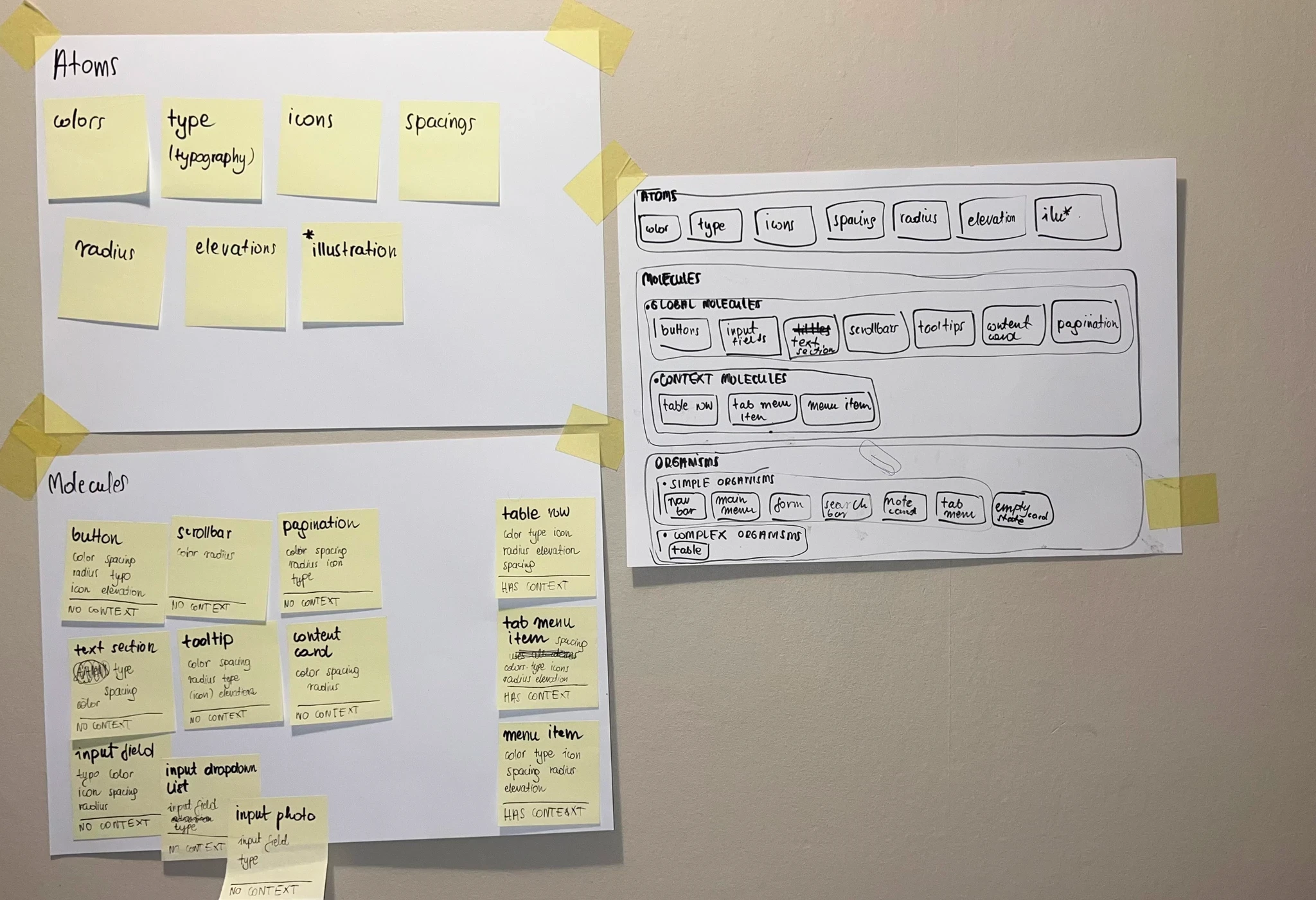
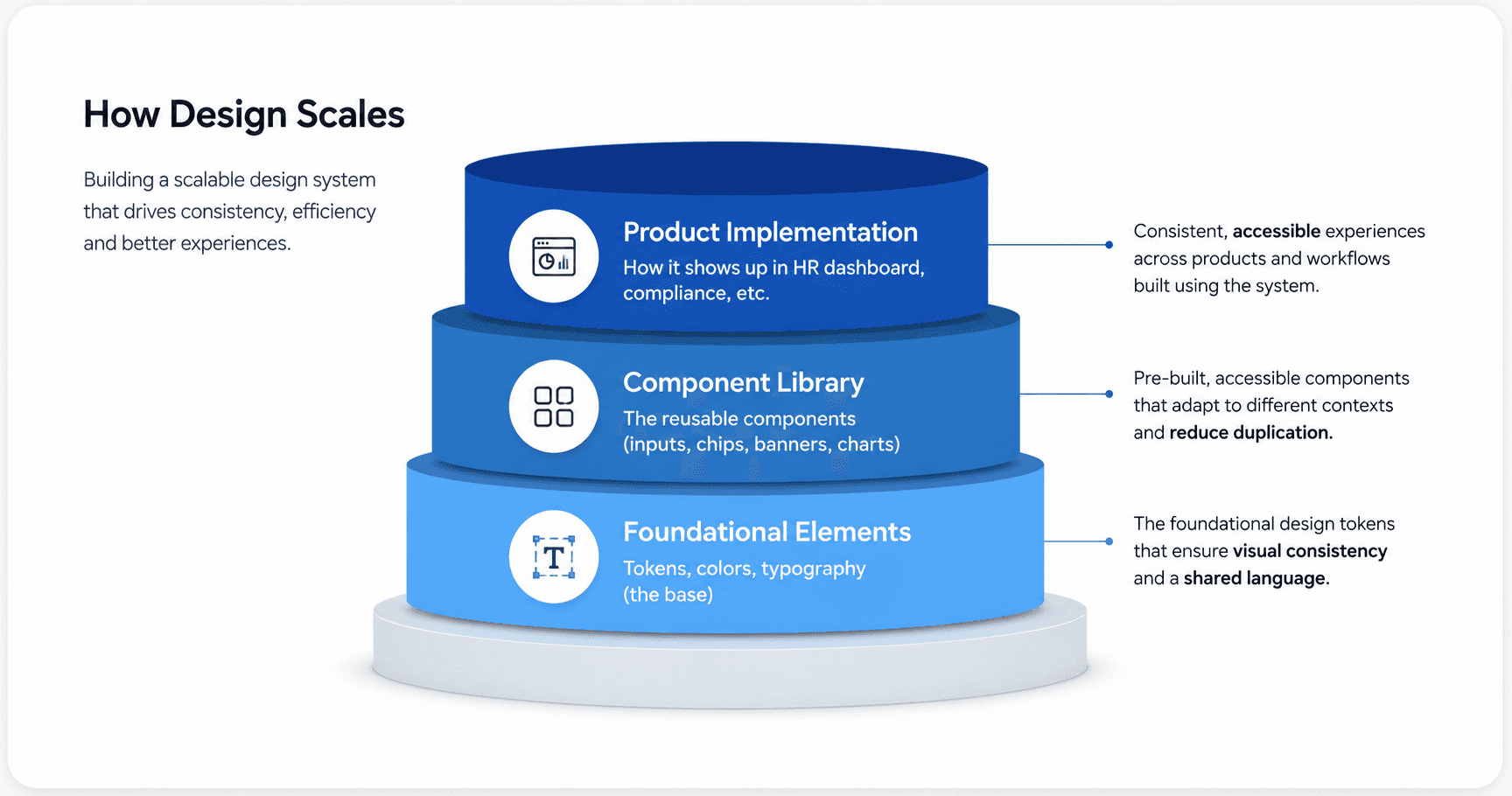
Every component decision started with the same question: does something like this already exist? Where it did, we standardized and refined it. Only where a genuine gap existed did we design net-new components. This reuse-first approach kept the system grounded in patterns teams already recognized, which made adoption easier later.
Multiple stakeholders including founders, the marketing head, and graphic designers were part of shaping direction, ensuring the system reflected both usability needs and brand consistency from day one.
Designs
Every state, accounted for.
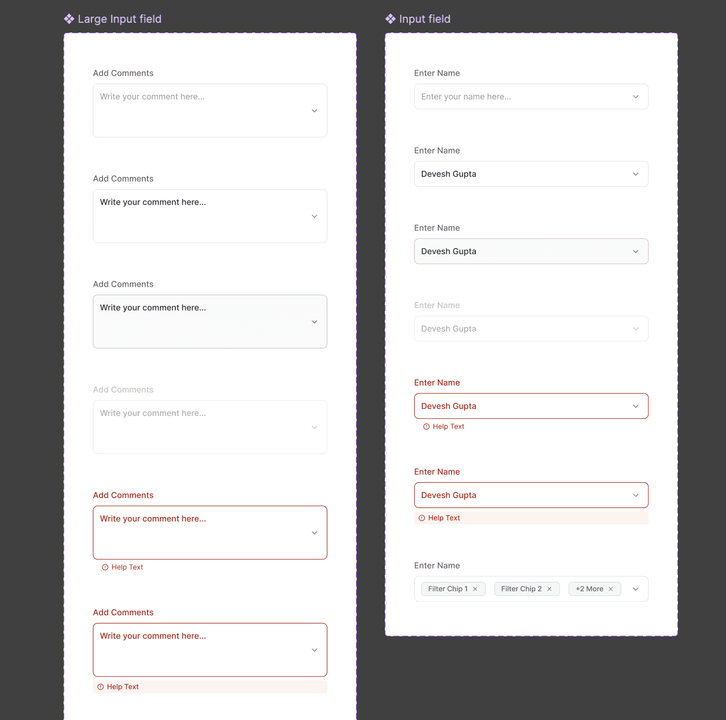
Each component was built with every functional state defined default, filled, active, error/help-text, and disabled so nothing shipped half-finished or ambiguous for engineering handoff. This level of rigor was applied consistently across form fields, chips, banners, and data visualization components, creating a system engineers could implement with confidence and designers could extend without guesswork.
Impact
Faster to build. Consistent everywhere.
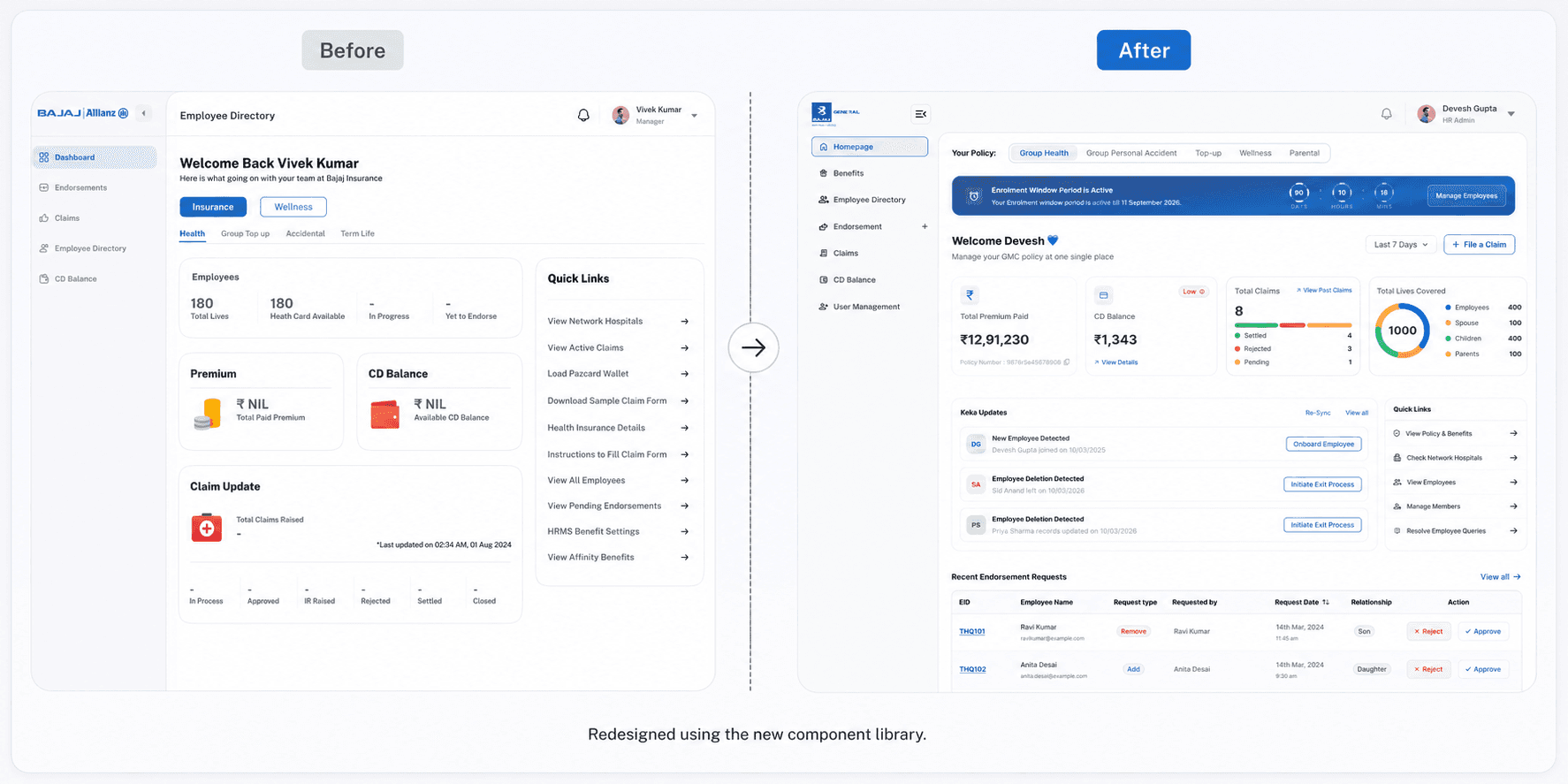
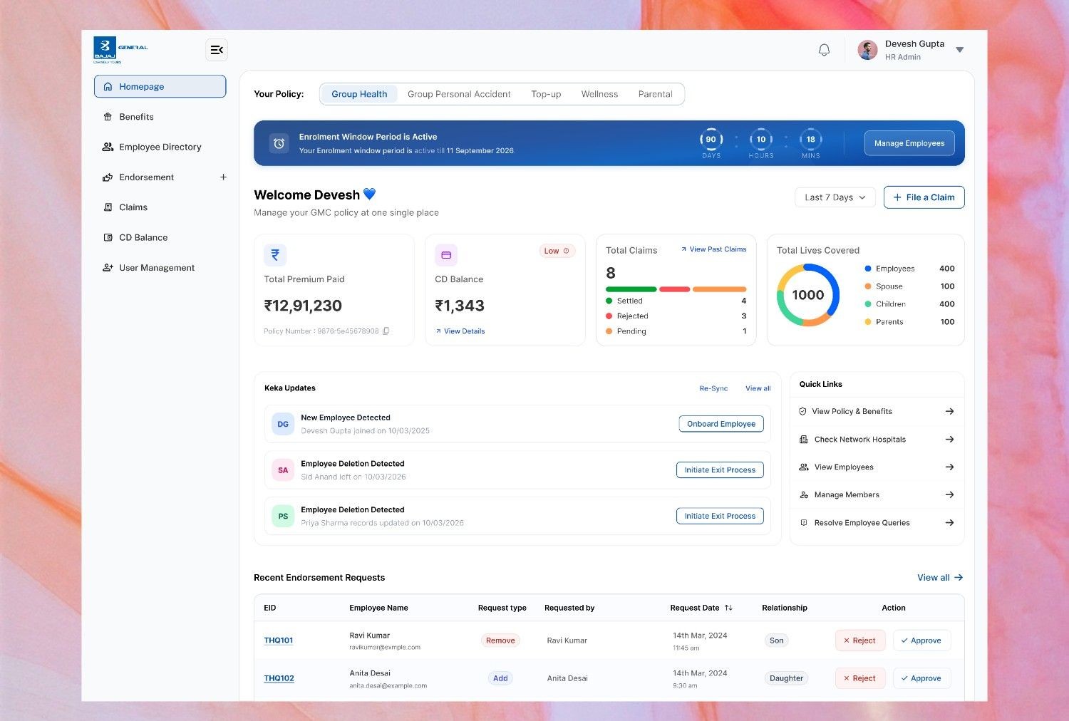
The system is still evolving, but the finalized parts of it are already being put to work reshaping how product screens get designed and built as adoption continues. It's been applied to a mix of redesigns and net-new builds using the components locked so far most visibly in the HR benefits dashboard redesign and in an entirely different product, the compliance/regulatory dashboard proving the system holds up across products that look nothing alike on the surface, even mid-rollout.
Results:
Faster design & development — reusable components cut the time to design and build new screens
Consistency across products — the same system now holds together visually distinct products, from HR to compliance
A shared design language — what was scattered and product-specific is now one system every team builds on.